
The COVID-19 pandemic left me with quite a lot of time on my hands, as I think it did for a lot of people. Where I might be traveling or spending time with friends I was now confined to one place and overdosing on screen time. With little else to do, I decided to redesign my work website and logo.
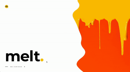
I started MELT, a web design company, back in 1997. In financial terms, it didn’t make me rich, but over the years it afforded me the freedom and opportunity to spend a great deal of time traveling and filling my life with stories and adventures from far-flung places.
I generally don’t think my logo is very important. I was never going for world domination or brand loyalty. I wanted my customers to relate more to me as a person rather than just another logo from some company they ultimately don’t care about. With that in mind, I always put more into building relationships rather than logos. I still have customers today that I had in the late 90’s!
MELT always had a logo. It was on my invoices and on one set of business cards I had printed in the very first year of business. The thing is, I never really liked any of the logos I designed for MELT, so while the world was locked-down I decided to fix that.
I’d been using a kind of ‘Batman’ style M logo for a while and I wanted to continue with the M, but I wanted it to be colorful. People often think the stories I tell are perhaps a little ‘colorful’ because surely this thing, or that event, didn’t quite happen like that, did it? (Yes it did actually!)
After months of tinkering with various designs, I eventually had three concepts that felt good to me (below). That was late September 2020. All I needed to do was settle on the design. But then Google unveiled their new logo for Gmail in October.
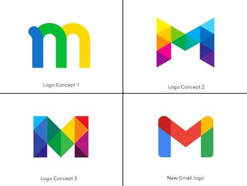
When I saw it I was annoyed. If I went with any of my concepts people would be reminded of Gmail, and while I accept that logos can often be similar, I just didn’t want to look that similar to Gmail.
At the same time of creating my logo I had been designing the new website, and feeling a little fed up I decided to just keep the ‘batman logo’ for the time being. The site was finished at I was cleaning up some of the typography late one night when I decided to change the color of the period marks to yellow.
![]() When I refreshed the page to review the change the idea came to me; what about adding an M to the yellow dot? I opened photoshop and created a simple yellow circle then added the black letter M. I looked at it for a while, then thought; how about adding a period mark to the circle, which had itself come from a period mark.
When I refreshed the page to review the change the idea came to me; what about adding an M to the yellow dot? I opened photoshop and created a simple yellow circle then added the black letter M. I looked at it for a while, then thought; how about adding a period mark to the circle, which had itself come from a period mark.
It was probably 3 AM and I remember sitting back in my chair, looking at my laptop screen and saying out-loud, “Yes!”
Sure, nobody cares, my customers talk to Simon, they don’t talk to MELT, but this logo, that effortlessly fell together in little more time than it takes to create a circle in photoshop, just felt right.
I like it, I’m happy with it, really for the first time I’m happy with my MELT logo. I also moved the website from its old UK domain to the new address melt.life which also feels right.
The new site is working too, and I’ve started to talk about being an “ethical web developer” with a view of moving toward using technologies that don’t abuse people’s privacy or trust.
That last bit is a little harder. Being an “ethical web developer” is a bit like being a “pacifist executionist.” But hey, it’s a start. It’s a new start.
![]()
Follow @itsgoodtomelt on Twitter


Wrote the following comment on Feb 23, 2021 at 2:43 am
I like the batman logo, but the new one is crisp and very professional-looking. The website is nice too. I like the movement.
So I’m curious about “ethical web development.” What is that?
Wrote the following comment on Feb 23, 2021 at 3:45 am
I love the rainbow logos Simon. What a shame you couldn’t use them,
Wrote the following comment on Feb 23, 2021 at 5:28 am
i like the first logo and the current one the best. the middle two seem like they’re not part of the evolution of your brand. but can i just say, as someone who works in branding and marketing, while you may not care about your logo or branding you do have a brand. you even wrote about it. you wrote “I wanted my customers to relate more to me as a person rather than just another logo — I always put more into building relationships rather than logos” and you wrote it again later; “my customers talk to Simon, they don’t talk to MELT” so then your brand is about building lasting trusted relationships beyond a transactional service. you mention “ethical web development” and “technologies that don’t abuse people’s privacy or trust” and how the new domain name, melt.life, feels right. for a brand strategist this stuff is gold.
Wrote the following comment on Feb 23, 2021 at 7:53 am
I work for a small company here Melbourne that has a shocking logo. My boss always says nobody cares about the logo, but its literally one of the things our customers always comment about because it’s so bad. I’ve tried many times to get him to invest in a new logo, but he says we’ll get one after we get {insert random renovation project} done. I like your logo, and I like your ethos too.
Wrote the following comment on Feb 24, 2021 at 5:39 pm
As per usual, Simon doesn’t appreciate how effortlessly he does thins stuff and doesn’t realise quite how brilliant he is.
He is the most talented poor person I know. He was doing podcasts and vlogging, way before they were a thing.
If only he could monetise his brilliance :-)
Wrote the following comment on Feb 24, 2021 at 7:41 pm
@Will – Thanks for the compliments Will, though I kind of take exception to being called a “poor person.” I think that’s a relative assumption. What’s the level up from poor? :-)
@Kym – I sent you an email with an idea for your boss.
@Fabien – Yeah I get what you say about my ‘brand.’ I kinda hate it all tho. I hate the need to have a ‘brand.’ I’m probably a little like Kym’s boss in that way. I get that it’s necessary (I designed a new logo didn’t I!) but I feel like I relate more to what comedian Bill Hicks has to say about marketing than what I am perhaps supposed to say as someone who works in digital media.
I’ve long said I wouldn’t wear any clothes with a brand on them unless that brand paid me. I guess this brand is paying me :-)
@Steve – What is ethical web development? In short, for me it’s the development of websites and apps that do not take advantage of people’s lack of understanding surrounding their personal data. So for example, many of us a stuck in what is an essentially abusive relationship with Facebook and Google, and those who do understand this continue to use their products shrugging their shoulders and saying “well what can you do?” I think what we can do is get out of the relationship both personally and professionally.
That said, I accept that many of my web customers will want to take advantage of the powerful targeting systems Facebook and Google have built up by abusing everyone’s trust, and so I won’t refuse to deploy the Facebook pixel or Google products, but I will endeavor to educate the customer on more ethical ways to deploy technology on their websites.
Wrote the following comment on Feb 24, 2021 at 10:51 pm
Firstly. I like your new logo Simon, and I like the ethical web development angle.
Re Will’s comment. Just wow. “The most talented poor person I know” Who the fuck says shit like that?! Was that whole comment a left-handed-compliment or is Will just a bumbling bourgee toff?
Wrote the following comment on Feb 24, 2021 at 11:46 pm
OMG! Kimba you are so right!
Wrote the following comment on Feb 25, 2021 at 1:20 am
Hello Simon. Kimba mentioned this blog on facebook (in relation to an unfortunate comment) but I thought as I am here I would just encourage you in your efforts to be an ethical web developer. I work in a similar field and we’ve been having discussions recently about ethical algorithms. You might want to take a look at https://www.ajl.org.
Your logo is great and I enjoyed reading about the process and your thoughts about logos too.
Wrote the following comment on Feb 25, 2021 at 3:10 am
Rainbow concept 2 looks like the Melbourne City logo. Come to that so does concept 3. See, this city is in your DNA Simon.
Wrote the following comment on Feb 25, 2021 at 4:44 am
I’ve always hated marketing bullshit too, so we’re on the same page. As for ya gronk mate, Will, that clumsy cunt sounded like he was washing ya balls until he said that shit about you being poor. Ooof!
Wrote the following comment on Feb 25, 2021 at 6:36 am
Well, I love the rainbow ones! They’re fun and inclusive. Too bad you couldn’t use them really. As for the comment Kimba highlighted (she mentioned it on facebook that why I swung by just FYI) that’s a really interesting comment in terms of interpretation. I’m guessing you know Will in person and can correctly decipher his tone, but wow, that could be read like a really cutting put down, lol!
Wrote the following comment on Feb 25, 2021 at 11:26 am
Not to echo what I said to Kimba on Facebook, but the term “poor” is debasing and, I think, to use it as part of a compliment shows a lack of understanding and witless privilege.
I don’t know Simon at all (hello Simon, nice blog by the way), but for someone to use the word “poor” to describe someone they know is rather shocking because it’s, at the very least, unkind. If Simon were indeed poor then is it up to someone else to point this out on his blog?
The term is, of course, subjective. What Will thinks of as poor may well be entirely different from what others think. We know that people’s economic circumstances often dictate whether they’re viewed as successful. When we hear that someone is poor, specific images may come to mind. But how does saying that someone is poor actually describe them? In other words, what does it say, or clarify, to define someone as poor?
If we use it to describe ourselves, the lens is ours to define. But when we’re talking about others the word is open to generalize people and perpetuate stereotypes when we use the term. The problem with generalizing people as poor is that without distinguishing an individual’s particular experiences with poverty, we don’t get the full context of the person or their story, and are therefore left to define it in our own terms and biases.
I suspect Will truly thought what he was writing was complimentary, but there’s a lot going on in that comment.
Wrote the following comment on Feb 25, 2021 at 1:10 pm
The logo for my practice used to be a great big eye. Everyone said it felt creepy so last year a new logo was created that is very nice and friendly. I think people care about bad logos maybe more than good ones, like your new one.
It’s funny how everyone is discussing the comment by Will. I had to go back and read it again to find the double meaning. Surely it is not intentional?
Wrote the following comment on Feb 25, 2021 at 2:40 pm
Raaaa! Kimba! Look what you started!
Simon, you’re not poor. I had a quick mooch around your blog and this doesn’t smack of the life of someone in poverty to me. I think Will is a just a yampy who dealt a cack-handed compliment. It’s hilarious really. Def no need for anyone to get a cob on.
PS. Your logo is very good.
Wrote the following comment on Feb 25, 2021 at 2:51 pm
Simon is one of my oldest and dearest friends, I know he took it in the way it was intended but understand how it looks to people who don’t know our relationship.
Simon is brilliant and should be a millionaire.
Wrote the following comment on Feb 25, 2021 at 3:51 pm
Will isn’t trying to insult Simon here. Quite the opposite it seems. But he is clearly tone deaf. Yes his comment reeks of privilege and a disconnect that comes with the kind of social comfort where people aren’t exposed to situations that pull them out of their lived experiences very often. But it’s a blunder in kindness.
It’s similar to all the times people say to me “You’re so pretty, how are you still single?” Often meant well, but if the people who said that stopped and thought about it for a second they might see how the implications behind it are entirely negative.
Wrote the following comment on Feb 25, 2021 at 4:06 pm
It reminds me when my grandfather said to my wife “You’re a really good driver… for a woman!” Ha-ha-ha :-)
Wrote the following comment on Feb 25, 2021 at 4:12 pm
Will = RWS
Wrote the following comment on Feb 25, 2021 at 6:00 pm
English is such an interesting language and it takes some time for non-native speakers to be able to pick up the subtle inflections and tones that are easily lost, even when you hear people speak the language.
We don’t know where Will is from, so as I commented in the Facebook discussion, I don’t think we can be so quick to condemn his apparent thoughtlessness. We’re assuming that because Simon is a native speaker (Australian? English?) Will is too, and I think that is an important bit of data that is missing here.
Could it be that Simon and Will have this humor between them? I spent 2 years living in London and the humor took me a lot of time to understand. I found the sarcasm extremely hard to navigate. Familiarity would bring with it a comfort in communication that others may misread.
My point is that there aspects to this discussion that people are assuming and I’m not comfortable to throw Will into the nettles with such little information.
Wrote the following comment on Feb 25, 2021 at 6:04 pm
Simon–Nice logo
Will–Engage your brain next time
Wrote the following comment on Feb 25, 2021 at 7:49 pm
Only a conceited arsehole would say something that stupid! So fucking wot if he meant well! That message denigrates his friend and amplifies his own perceived social and financial success. There’s a dickish lack of humility, or if his friend really is poor, a lack of empathy. Any way you cut his comment I think it exposes his superior attitude over his friend. “Qu’ils mangent de la brioche!”
Wrote the following comment on Feb 25, 2021 at 9:01 pm
[This comment was removed because it contained needless insults. Anyone is welcome to comment, but don’t be a troll or abusive. This person is banned from making any further comments.]
Wrote the following comment on Feb 25, 2021 at 10:56 pm
Firstly. Nice logo Simon. Good luck in business. I hope that you make enough to pull yourself out of the poverty your friend thinks you’re in.
Secondly. I think your friend Will is a nitwit. I can see that his sentiment was well meaning, but that line about being poor really is just thoughtlessly stupid. I hope that he can see that now.
Wrote the following comment on Feb 26, 2021 at 1:02 am
Hey Simon, if you are poor look on the bright side…
“Blessed are you who are poor, for yours is the kingdom of God.” – Luke 6:20 ;-)
Wrote the following comment on Feb 26, 2021 at 3:41 am
Hey I like that logo Simon. The new yellow circle one. I like the site too and how it’s not very wordy. Well done on trying to be an ethical web developer. We need more of those! Oh and hey, nice hat!
Wrote the following comment on Feb 26, 2021 at 3:53 am
People who are poor are not just like us, only with less money. Being poor is not an inconvenience or a transitory phase. Poverty is a crisis, a wrenching experience that quite literally means death for millions.
Wrote the following comment on Feb 26, 2021 at 4:32 am
Here’s my take on the “poor” discussion.
I think Will definitely tripped over his privilege on this. Calling out his friend for being poor is just a crappy thing to do. Telling everyone his friends financial situation (albeit this is just his opinion of his friends financial situation) is thoughtless. I would say it also reveals something about how he sees Simon.
Who knows, maybe Simon is poor? That’s not for Will to tell anyone of course, but my point is I don’t find the term offensive. If Simon is poor then that’s unfortunate and one would hope Will would be doing whatever he could to help his talented friend.
Wrote the following comment on Feb 26, 2021 at 5:22 am
Simon and I have known each other for over 25 years, our friendship has a shorthand that I appreciate strangers don’t understand. So while your commentary and opinions such as “I’m a clumsy cunt’ are well meaning, miss the mark entirely.
Wealth is relative, and if Simon wanted all the trappings of success, he could have gone down that road. He has chosen not to, and as a result has probably lived a life more exciting and fulfilling than most. What has been constant over the 25 years I have known him is that his level of happiness has remained constant despite how much money he has.
Clearly the word poor is a trigger word for many of you, but can I make a suggestion, don’t be so quick to judge people, especially when you have such little data and context to make that judgement. Everyone is entitled to an opinion, but not every opinion carry’s equal weight.
Simon wasn’t offended by my comment, you shouldn’t be either.
Wrote the following comment on Feb 26, 2021 at 9:55 am
Will is a scientologist.
Wrote the following comment on Feb 26, 2021 at 11:05 am
Anyway… the logos!
Wrote the following comment on Feb 26, 2021 at 11:30 am
This has been an interesting thread to follow. So yes Will, I don’t know you and I’m guessing the most people here don’t know you either. Yes, you and Simon have a ‘shorthand’ and yes, many friendship have such language, but its ironic, perhaps deliberately, that you’re choosing to defend your comment by citing the same argument most people here have used when criticizing your unfortunate form of compliment. You say Simon didn’t take offense but in comment #6 he takes exception to what you said, so what’s that then?
Wrote the following comment on Feb 26, 2021 at 1:43 pm
Will, your friendship with Simon does afford you shorthand as you say, but if Simon is “poor” then you mentioning that is judgmental, it just is.
The word poor isn’t a trigger word, but it is a word that, as Aparajita said so well, brings certain images to mind, none of which are positive, so to see that word used in an otherwise lovely comment signaled unconscious privilege and I reacted to that.
I’m sorry Simon. I mentioned Will’s comment in a discussion on Facebook about the language of privilege. I shouldn’t have linked to the post because these comments have taken away from the very good work you shared as a designer.
And Will, I didn’t mean to start an internet pile-on, so I’m sorry about that.
Wrote the following comment on Feb 26, 2021 at 2:51 pm
Kimba, that’s quite alright, I’m really not that bothered what a bunch of strangers on the Internet think about me, I’ve got a thick skin.
Simon lives a very nice life and spends the winter months in South East Asia and leads a pretty wonderful stress free life. I envy him in many ways and he has inspired me to live more freely on many an occasion. He has a nack of being a trailblazer and perhaps it’s a little frustrating on my part that he isn’t rewarded financially to the extent I believe he deserves.
Me saying he’s the most talented poor person I know was a throw away comment that I really didn’t think about after posting it, I’m sorry it has detracted from the original purpose of the post. However, I hope that now it has caused a bit of a cafuffle that the post will get more exposure and my friend will get some work of f the back of it. Maybe this is a convoluted marketing strategy, Simon posts, I Wade in and put my foot in it, post gets loads of exposure, people give Simon work ?
Can anyone lend me a fiver? I’m skint ?
Wrote the following comment on Feb 26, 2021 at 4:40 pm
So I’m gunna front up and say that I mean Will no dis with what I’m gunna say right now.
Unconscious privilege is like white privilege or gender privilege. The folks who enjoy it don’t really think about it because it’s never been something they’ve had to try and overcome. It’s like able-bodied people walking up a set of stairs don’t think about what it might be like to navigate the same place in a wheelchair, right?
So in his defense, Will mentions how being poor is relative, but he doesn’t use that term. Instead, he makes the uncurious switch to the word wealth because in his world the two words mean more or less the same thing. But right after the word wealth, he mentions choice and that’s because wealth and choice are related. Poverty and choice aren’t.
It’s subtle and a lot of folk would brush it off, but that’s the point. People with the privilege don’t have to spend much time thinking about this. Wealthy people don’t need to spend as much time worrying about making ends meet as less well off people do, white folk don’t need to think about how their resume will be read in the same way people of color do, men don’t have to think about their safety in the same way women do. Do you see my point?
I don’t write this to bash Will or embarrass the guy. I write this because as someone who has faced and continues to face all kinds of challenges in life, related in part to people’s unconscious privilege, I feel like it’s helpful to respectfully speak up when you see things like this. Most of the time people brush it off, but you know change takes time, and time I got.
Wrote the following comment on Feb 26, 2021 at 6:30 pm
Okay, 34 comments later I’m going to respond.
First, Will has been a fantastic friend and ally of mine for nearly 30 years and as you would assume, we have indeed built up a very familiar way of communicating in that time. He’s a friend I know has my back, and someone I can always speak freely with, knowing that he gets me. He’s generous, funny, and caring. Trust me, if he was a dick it would have been easy to give him the slip over the years, but I haven’t because he isn’t! It’s as simple as that.
Did it insult me when he called me the “most talented poor person” he knew? No. He’s said that to me a few times, usually in the same context of a genuine compliment. It comes from his wish that I was as financially rewarded as others he’s seen making similar content.
He rightly points out that I was podcasting before podcasts, producing videos before the rise of the youtube stars, and blogging before blogs. Had the timing fell better, maybe I would indeed be rolling in cash and endorsements. He was acknowledging my talents and expressing what I think he sees as a travesty of timing. Trust me when I say I know his comment comes from a good place.
Now, I understand that a lot of the people who are commenting here are coming from a different discussion about the language of privilege, and in that vein, I can see how what he said was jarring.
I took it as it was meant, a compliment, albeit, yes a “clumsy” one. And in the very next comment, I said “I kind of take exception to being called a poor person.” But as Will points out, I knew how to take it.
So, clearly, people have come over here from some facebook group and Will’s comment is being held up as an example of unconscious privilege. Is it that? Honestly, I hadn’t given much thought, in the same way, I think he didn’t when he wrote it. But yes, on reflection I think one could say it is.
I’ve spoken to many people for whom the pandemic has been fantastic. At times some people’s apparent obliviousness to the plight of those who have been adversely affected by the pandemic has irked me. But we live in our own realities don’t we, and if I’ve learned anything from traveling across the world and experiencing different cultures, it’s that we could all do better at imagining what it might be like to be in someone else’s shoes.
Honestly reading some of these comments I’ve found myself thinking a little deeper about the issue of privilege, and specifically unconscious privilege. Last year I did an implicit bias test because I do have an interest in the complexities of our minds. I try to consider intent vs impact and actually this thread is interesting.
As for whether I am “poor” or not, I would say I am not poor. For me, that word signifies someone who is experiencing serious hardship creating barriers and/or perils in their life. That’s why I raised an objection to Will categorizing me that way because I am certainly not in that situation.
That said, it’s fair to say that this pandemic has had a pretty devastating effect on my finances because I decided to move away from web development and into tourism in 2019.
And finally, I’ll just say that I think it’s sad that society measures success by those “trappings” Will talked about. I would suggest they’re called “trappings” because they are indeed a trap, and by definition, they’re an absolutely abysmal measure of someone’s success in life.
He’s right when he said I chose not to go down that well-trodden route to “success” in life. I don’t have the house, the car, the smart-watch, the big-ass TV with subscriptions to all the streaming channels. Instead, I live a simpler life and one in which I do have to watch my finances very carefully in a way Will does not. But right now it’s not money I miss, it’s the opportunity to be out in the world looking for the moments that make up my storied life.
But hey, that said, right now I am looking for new web work! Contact me at melt.life :-)
Wrote the following comment on Feb 27, 2021 at 11:40 am
Well I have to say that I found this whole thread very interesting indeed. Who would have thought a post about your new logo would end up in a conversation about language.
The comment that really puzzled me was “Will is a Scientologist.” Was that an insult? A compliment maybe? Or is that someone outing Will as a closeted Scientologist? :-)
Come on everyone, LEAVE WILL ALONE!! :-)
https://youtu.be/lVQOLX1wDAc?t=53