
I need your help choosing my new company logo. From the four designs below leave a comment telling me which one is the best.
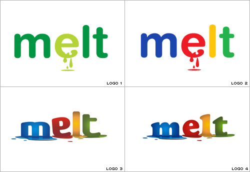
MELT is my web design and consultancy company. It’s been paying my bills since 1998 but has long been in need of a serious makeover. I don’t expect the logo to communicate a great deal as the word ‘melt’ on its own hardly explains what the company does, but I wanted the logo to be cool and modern with an edge of professionalism to it.
I often say that the MELT work ethic has a “20% time” rule similar to Google. The search engine giant is famous for allowing it’s developers to work on their own projects for 20% of their time at work, citing this as an essential part of what drives innovation and creative thinking within the company.
However, I joke that the “20% time” rule at MELT means that 20% of the time at work should be spent doing something work related!
Of course, in reality there is no such rule because I think I strike a very healthy work/life balance. But it’s time to for a little corporate rebranding, so while I rarely post about work related things, I would really appreciate your help in deciding which of the new logos to go with. Please leave a comment letting me know which logo you think is the best.
—
UPDATE
Final logo design choice shown in comments (Comment #31)


Wrote the following comment on Nov 17, 2010 at 5:17 am
Dont like 3. at all! 4. Is the perfect logo but is it too perfect? 2. The blood dripping e um! not too sure about that either! 1. Interesting! could their be an angle on a Green dripping e?
Sum up 4 or 1
Wrote the following comment on Nov 17, 2010 at 5:53 am
20%? That number is a little high I feel. Don’t you mean 20 day ;-)
Wrote the following comment on Nov 17, 2010 at 6:00 am
I like the font of number one and two, but they both look more like they’re bleeding (particularly number two) than melting. I like the gradation that you have on both three and four, and both of those better express the idea of melting, but I think I lean towards number three.
Wrote the following comment on Nov 17, 2010 at 8:19 am
I think the ‘e’ in number 3 looks too odd. For me number 4 is the best but to be honest i am not too keen on any of them……………..sorry!
Wrote the following comment on Nov 17, 2010 at 9:14 am
HI Simon
The last one – no 4 stands out massively if not a little google like.
Defo the one i would go for.
Regards
Mark
Wrote the following comment on Nov 17, 2010 at 1:34 pm
I choose Logo 1. for the calming colours and has a green environmental feel to it.
Logo 2 looks too similiar to google logo.
Logo3, 4 not a good omen as it’s looks like melting, your company should be blooming not looking like it’s in a melt down ^_^
Wrote the following comment on Nov 17, 2010 at 3:42 pm
numero uno
Wrote the following comment on Nov 17, 2010 at 5:40 pm
By the way, I agree the “e” in number three looks odd. If I can push you towards revision, I would use the font of number 2, but the melting imagery and the gradation of number 3.
Wrote the following comment on Nov 17, 2010 at 8:00 pm
logo #4 is ths best. I agree w/ the first poster’s comment, that logo #3 is not good. mainly because the letters are out of shape, whacked up a bit. you dont want to communicate that to your clientele. #1 and 2 are too simple.
#4, by far, is the best.
Wrote the following comment on Nov 17, 2010 at 8:56 pm
Hello Simon
I don’t know if it matters two hoots to you, but I worked on a few visual identification jobs in a very sought after architectural firm back in my previous life, so I have some hands-on experience in this matter.
This is a brilliant idea of yours to ask around for an opinion. You could also announce a competition to broad public and choose the best creation, although I know that designing on your own for yourself gives great satisfaction.
Logo1 is my fav. Green is always in fashion. I like it’s simplicity too. First thing that came to my mind seeing 2,3,4 was Google. The combo of the colors is just wrong. If you got too much ispired with theirs, I warn you, don’t go this way. This fidelity is the last thing you want your clients-to-be to spot.
Also if you intend to use it on business cards and company stationery, print out samples to see how the logo looks in small size. Will these melted letters still look like melted letters when the logo is just one inch or less or just like an imperfection of the print? Do they have to melt at all? Do you have to be so litteral? If your logo said “fire” would you have to include chariots of flames for it to be authentic? My masters used to print out their work on A3 sheets of paper, then place it at, say, 3 meters distance and look at it while slitting the eyes, so that you can see only a blurred shape. Is the balance of colors still right? Is the composition coherent? If you had only two seconds to look at it (displayed on a fast moving vehicle) would you want to see it again or not? Anyway, I think No1 is the coolest.
PS. Sorry if my English is crap, I only just started learning ;-).
Wrote the following comment on Nov 17, 2010 at 9:13 pm
I’ve just had one more look at all of them from a great distance and I tell you go for No1, man. The others are good for a business selling toys for children not for a web developer. Nr4 is too much of a picture, after all, not a logo.
Wrote the following comment on Nov 17, 2010 at 10:47 pm
Heh…I know it’s already my third comment today, but applied arts is my hobby and I just can’t help sharing my thoughts on it haha (btw It’s the first time I have been commenting here, although been visiting this blog regularly for a long while).
A good idea I think would be placing your potential new logo in a collection of, say, thirty logos of your competitors or just randomly picked logos and see how yours feels in such a neighbourhood. Does it stand out? It doesn’t have to really, but it must not look silly. For this reason I would avoid the Google feeling already spotted by many. If yours were displayed next to theirs (which you would desire for, wouldn’t you?) they wouldn’t come well together. Such collections of logos are often seen on marketing materials for big events like concerts, marathons and the such. All the colors are often reduced to monochrome (blue or black). Try this as well. Btw, are we talking here about refurbishing your company site?
Wrote the following comment on Nov 19, 2010 at 3:00 am
Some really valuable comments there. Thanks everyone.
I’m still really stuck. I like number one, the simplicity is what gives it the edge i think, but number 3 is also a favorite of mine because it just looks funky and while the letter is looks odd, I rather like the oddness.
However, having leaned strongly toward 3 or 4 for the longest time I am now switching back heavily in favor of number 1 because of the advice of OleGunar about printing them out onto paper. Doing that really gave me a different impression. 3 and 4 looked nice, but more like a childs toy of something, whereas number 1 looked more business like.
I’ll decide tomorrow, but does anyone else have any suggestions?
Will, you didn’t give a choice.
Wrote the following comment on Nov 19, 2010 at 3:39 am
I like the first one. The green feels friendly to me though like Dom I’ll be honest and tell you that I don’t particularly think any of the 4 really strike me. It’s a funny name though. How come you called the company melt anyway?
Wrote the following comment on Nov 19, 2010 at 3:51 am
#4 is my choice. #1 looks like some of those clever BP oil spill logo’s that did the rounds in the summer.
Wrote the following comment on Nov 19, 2010 at 5:50 am
2-4 all look very Google derivative. 1 is better, but it looks like the Mint.com logo. Do you need that much color? Maybe start w B&W and find a design you like, and go with color options from there.
Wrote the following comment on Nov 19, 2010 at 9:41 am
No 1 & 4 look more developed and “pro”. No1 looks like a wind genie company or such green concern. No 4 looks a little too much like google, because of colours AND font. So I choose 3, which is unique, but has probably “webbie” undertones because of google colours.
Wrote the following comment on Nov 19, 2010 at 9:45 am
But… Looking again, 3 is like early learning centre… so not for me.
It’ll have to be 4, with different colours.
Wrote the following comment on Nov 19, 2010 at 9:52 am
Immediate thought on 2,3,4 – Google:
No 1 – too bland.
Wrote the following comment on Nov 19, 2010 at 10:10 am
I don’t like either particularly to be honest. No. 2 has horrible colours ?!!!!
I went to look at the old logo, and if i had the choice between the 5, it would be the old logo, but sure, I’m not staring at it for years already and I know very little about all this anyway.
the green is okay although I’d go for something more simple (don’t like the bleeding e)
there are so many company logos, it’s almost impossible to make a ‘new’ or ‘remarkable’ one I think. In order to retain legibility you can’t do too much fancy stuff, so I’d just go for something that looks nice. In harmony… something you wouldn’t mind looking at if it would be a big poster something…
Anyway, I better make tracks and go and learn something.
good luck deciding.
Wrote the following comment on Nov 19, 2010 at 10:49 am
I’m very sorry but I don’t like any of them. Is your company melting? Falling apart? The name Melt sounds cool on its own, and can stand disconnected from its original meaning, which it has for me all these years.
And, I know this is late, you’ve already decided, so…I love your decision!
;)
Wrote the following comment on Nov 19, 2010 at 10:59 am
Heya Simon!
Having a good ol’ rebrand eh? Fun fun fun! I can’t help but throw in my miniscule amount of change. I think i like the bad news before I like the good, so I’m going to treat you no different than I would have others treat myself and get all the bad out off the bat.
I’m not sure why, but from a personal stand point, I can’t quite get over the serif font in 4. I don’t know why, but to me a serifed typeface just isn’t what I’d go for when branding Melt. So for me, on that point alone, I’d strike out number 4.
My problems with 2 and 3 are the colour scheme is rather google. And what you do is nothing like what google does, so I don’t think that the colour scheme is helpful, even if it is playful.
And with 1 and 2, I find there is very little pop to them. There’s little that makes them stand out off the page and go LOOK AT ME. And again, I’m thinking it’s the typeface that does that, I personally would have gone with a completely different typeface.
And with 1, the green colour scheme makes me think you’re an eco company that melts down plastics and recycles them. On top of that, I think you’re better than one colour.
That said, I personally like the puddles in 3 and 4, I lean towards them much more partially because of that and partially because the internal shading gives it much more pop than 3 and 4.
I understand what olegunnar says, but I think that with modern printing, getting a crisp print out that does them justice, even at a small size would not be difficult. And as for a minuscule one on your website in the top corner to go home or something – why not just have a small puddle? People will get it, I don’t think we need to spoon fed as much as people DO get spoon fed stuff nowadays.
I think as humans we are pattern seeking enough that we will all instantaneously recognise it as a puddle because that is how we’re programmed, it’s why we can draw stuff and know what it represents without having to concentrate on it.
3 for me, which seems to have been the least popular choice thus far, is the best, but I think that the typeface would do with a bout of touching up. Also, despite the colour scheme, it is the least google-y. I understand the urge for the 3 primary colours plus green (primary colours/monitor colours) but maybe you could play about with the hues to make more you?
Anyway, I really like the puddles and I think the whole design has a much more you feel to it in number 3. Remember that you’re not designing for others, you’re designing to represent you, so if you’re drawn to something, picking something else is going to represent others rather than you. Take our advice under consideration, but the final choice should be yours.
Wrote the following comment on Nov 19, 2010 at 12:53 pm
Thank you everyone for this invaluable feedback. It’s been very interesting to read the differing opinions. In the end I have decided to go with a variation of number 3 where it’s more blue than multi-colored.
I was leaning heavily in the direction of number 1 for the longest time, but there was just something a little funky and different looking about 3 that kept bringing me back to it. The E is all wrong with it, but it started to grow on me and I found myself liking the fact that it looked a little strange – I think I’m a little strange so maybe there I was relating to it :-)
I’ll let you see the finished logo right here when it’s done (I’ll post it as a comment). But I’m still open to hearing your suggestions or feelings, and once again thanks to everyone who took the time to give me their opinion.
Wrote the following comment on Nov 19, 2010 at 6:23 pm
I don’t like number 4 or number 2 at all. I can see the attraction to number 3, but my money is on number 1 because it seems more business like. But then, from your 20% time comment, maybe that’s exactly why you shouldn’t choose number one?
Wrote the following comment on Nov 19, 2010 at 8:19 pm
How funny, I have a 20% time rule too Simon. I can spend 20% of my time at the computer looking at online porn. Since instituting this policy I can tell you it’s done wonders for the productivity and general fitness of my right forearm.
Wrote the following comment on Nov 20, 2010 at 9:34 pm
logo 3 is best as it represents the correct meaning of the word – characters are not perfect and looks like they’re melting
Wrote the following comment on Nov 21, 2010 at 4:38 pm
Simple is always best with me for logos. Therefore my vote goes with number 1. Clean, simple and looks great.
The other three look a little to Google like for me with their colour.
Wrote the following comment on Nov 22, 2010 at 1:59 am
I’d say number four, definitely.
Wrote the following comment on Nov 22, 2010 at 3:08 am
I like number 4 best
Wrote the following comment on Nov 23, 2010 at 12:47 pm
#1 or #4 :)
Wrote the following comment on Nov 25, 2010 at 11:52 am
And the winner is…
Thank you to everyone who left comments regarding the choices and ideas for my new company logo. After a few adjustments I’ve decided on the final design.
The new logo is a variant of the third choice of those I put forward in the last post.
Initially I wasn’t that keen on this design, I thought the letter E looked all wrong, but I actually think that’s one of the things I like about this design. After your input I played around with the color a little and came up with the blue version which seemed to me to make more sense.
I know some of you will not like my choice, such is the nature of design. In the past companies have received such strong opposition to their new logo’s that they’ve scrapped them. Clothing giant, GAP, recently rebranded and were later forced by popular opinion to revert to their old logo. Orange juice company Tropicana also reverted a radical packaging and logo redesign in the face of widespread derision from the public.
I’m happy with my choice though. What I like about it is that it’s a little ‘off the wall’ and ‘funky’ (designers HATE that word because people use it all the time and it actually is of no descriptive help at all in a design brief). So, for 2011 at least, this will be the new face of melt.
Wrote the following comment on Nov 25, 2010 at 9:04 pm
Congratulations on your final choice Simon.
PS. Designers hate the word ‘nice’ yet even more.
Wrote the following comment on Dec 1, 2010 at 9:56 pm
I like number 4